Wood Undertone in Interior Design: How Warm and Cool Tones Shape Hotel Atmosphere
Wood undertone decides whether a console table feels welcoming, calm or austere once it sits under real hotel lighting. This guide explains red, yellow and grey undertones and how to specify them for hospitality projects.
Wood undertone interior design is about the subtle hue beneath the visible colour of timber: the red, yellow or grey cast that makes two "light oak" samples look completely different on a wall. For hotel projects, undertone matters as much as species or finish, because it determines whether a console table sits comfortably with the walls, flooring and lighting around it. This article explains the main undertone families and shows how to specify them clearly when you order custom pieces.
What Is a Wood Undertone?
Every wood colour has two layers. The surface tone is the name you use in a brief, such as walnut, natural oak or ash grey. The undertone is the underlying cast that shows up in certain light, next to certain materials, or when the sample is compared with another one.
Undertones fall broadly into three groups:
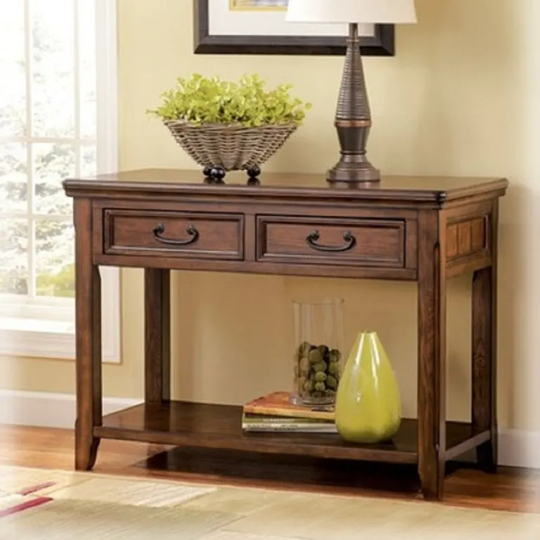
- Red undertones: found in cherry-like stains, some walnut finishes and mahogany-type tones. They read as rich, formal and traditional.
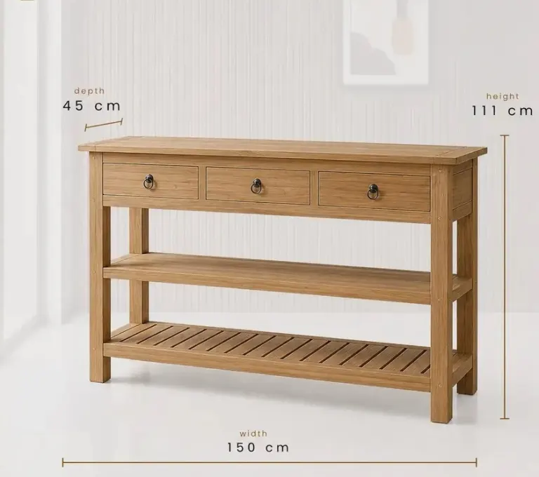
- Yellow or orange undertones: typical of natural oak, beech and ash under clear coatings. They read as bright, friendly and informal.
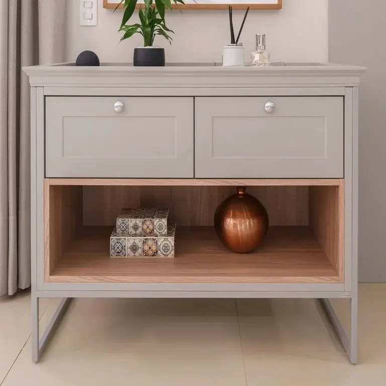
- Grey, green or neutral undertones: found in limed oak, ash-grey stains, smoked finishes and some dark walnut tones. They read as calm, contemporary and restrained.
These are visual families, not strict categories. Many finishes sit between two groups, which is exactly why a written colour name is never enough.
Warm vs Cool Wood Tones: Mood and Perception
The discussion around wood colour psychology is often oversimplified, but a few practical associations hold in hospitality design. Warm tones tend to feel inviting and relaxed, so they suit arrival areas, lounges and restaurants where you want guests to settle. Cooler, greyer tones tend to feel quieter and more precise, which suits spas, business hotels and minimalist interiors.
Treat these as design tendencies rather than rules. Perception also depends on culture, local taste and the brand's own identity. A console table in a warm tone can look sophisticated in a dark, moody lobby, while the same tone can feel heavy in a small, windowless corridor.
How Lighting Changes Undertone
Lighting is the factor that most often surprises buyers. A finish approved under factory light can look different once installed, because the colour temperature of the lamps pushes the undertone one way or the other.
- Warm white lighting (around 2700 K): amplifies red and yellow undertones and can make grey tones look slightly beige or muddy.
- Neutral white lighting (around 3500-4000 K): shows the finish closest to its true colour, which is why many designers check samples under it.
- Cool white or daylight (above 4000 K): emphasises grey and green undertones and can make warm woods look flatter or slightly yellow-green.
- Natural daylight: changes through the day and by orientation, so a north-facing lobby will treat the same finish very differently from a south-facing one.
For hotels, the practical step is to review the sample under the actual lamp type planned for the space, and ideally next to the wall paint, flooring and fabric samples as well.
Wall Colours and Undertone Pairing
A console table is almost always seen against a wall, so the wall colour does much of the work in shaping how the wood reads. Consider these pairings as a starting point for discussion with your designer.
| Wall colour | Works well with | Watch out for |
|---|---|---|
| Warm white or cream | Yellow-toned oak, light walnut | Very grey woods can look cold and flat |
| Cool white or pale grey | Grey-toned oak, ash, smoked finishes | Strong red tones can look out of place |
| Deep green or navy | Warm walnut, red-brown tones | Very dark woods may disappear into the wall |
| Terracotta or sand | Natural oak, neutral light tones | Reddish woods can blend and lose definition |
| Charcoal or black | Light oak, natural ash for contrast | Dark grey woods may lack depth |
Contrast is also a choice. A console table that matches the undertone of its wall feels quiet and integrated, while a table with the opposite undertone becomes a deliberate accent. Both approaches work, but they should be decisions, not accidents.
Coordinating Undertone with Floors, Doors and Other Joinery
Console tables rarely stand alone. In a lobby or corridor they share sightlines with flooring, wall panelling, doors, reception joinery and loose furniture. Mixing undertones across these surfaces is possible, but clashes happen when two woods are close in colour yet different in undertone, such as a yellow-toned oak floor beside a grey-toned oak console.
A simple rule is to choose either clearly matching or clearly different tones. Near-matches tend to look like mistakes. If the floor and wall panelling already carry a strong undertone, consider keeping the console table within the same family or moving decisively to a contrasting finish.
Species, Grain and Finish: What Drives Undertone
Undertone is not only a stain decision. Several factors in manufacturing influence it:
- Species: oak naturally leans yellow, walnut leans brown with violet or grey tints, and ash is pale with a slightly cooler cast.
- Veneer or solid wood: natural variation between boards or veneer sheets creates small undertone shifts within one batch.
- Stain and pigment: grey and white pigments can reduce yellow, but they change how grain appears.
- Topcoat: oil tends to deepen and warm the colour, while water-based clear coats can look cooler. Gloss level also changes how colour reads under light.
This is why a finish name from one supplier may not match the same name from another. For a deeper look at related decisions, see the notes on species and finish choices in our other guides.
How to Approve Undertone Before Production
Because undertone is subtle, approval needs a process rather than a quick glance at a photograph. We recommend the following steps for international projects:
- Share reference material such as photos of the wall paint, flooring, fabrics and lamp specification, not only a colour name.
- Request finish samples on the same species and grain type that will be used in production.
- Review samples in the real space or under the planned lamps, at the times of day when the area is most used.
- Place samples next to the neighbouring materials, not on a white desk.
- Confirm the approved sample in writing and keep it as the reference for the full order.
Because we manufacture to project drawings and ship worldwide, we often work with buyers who cannot visit the factory. In those cases, a physical sample sent by courier is more reliable than screen-based colour matching, since monitors and phone cameras shift undertone.
Regional and Brand Considerations
Preferences vary between markets and brand types, and they are worth discussing early. Some hotel groups prefer lighter, more neutral woods across properties, while others use deeper tones to signal a premium positioning. Climate and daylight also play a role: strong sunlight in warm regions can wash out pale finishes, and low winter light in northern regions can make cool tones feel stark.
If you are building a portfolio across several countries, consistency of undertone usually matters more than consistency of the colour name. A finish can be adjusted slightly per location, provided the approved reference stays the same.
Common Undertone Mistakes to Avoid
- Approving a finish from a digital image only.
- Choosing colour under showroom lighting that differs from the hotel's planned lamps.
- Using near-match woods in the same sightline.
- Forgetting that oil, lacquer and gloss level change how the colour reads.
- Describing the colour with words like "honey" or "espresso" without a physical reference.
Conclusion
Wood undertone shapes how a console table feels in a hotel long before guests notice species or construction. Define the undertone as part of the specification, test it under the real lighting, and approve it against neighbouring materials. If you are planning console tables for a new hotel or renovation, send us your drawings, finish references and lighting details, and we will recommend suitable tones and prepare samples for your quotation.
Sıkça Sorulan Sorular
What is a wood undertone?
A wood undertone is the subtle underlying hue beneath the visible colour of timber, usually red, yellow or grey. Two finishes with the same name can look very different because of undertone, especially under different lighting or beside different wall colours.
Are warm or cool wood tones better for hotels?
Neither is better in every case. Warm tones suit lobbies, lounges and restaurants where a welcoming mood is wanted, while cooler tones suit spas and contemporary business hotels. The right choice depends on lighting, wall colours, brand identity and the space itself.
How does lighting affect wood colour in a hotel?
Warm lamps amplify red and yellow tones, while cool white or daylight-type lamps emphasise grey and green tones. Daylight also changes through the day. Reviewing samples under the planned lamp type helps avoid surprises after installation.
Can you match a wood undertone to my wall paint or flooring?
Yes. If you send paint references, flooring samples or photos along with the lamp specification, we can prepare finish samples for your review. Physical samples are more reliable than screen colours, so we recommend approving a sent sample before production.
Why does the same finish look different on oak and walnut?
Each species has its own natural colour, grain and absorption. Oak leans yellow, while walnut is browner with cooler tints. The same stain or coating reacts differently on each, so finishes should be sampled on the actual species used in production.
Every hotel project is different. Send us your drawings or room schedule for a tailored proposal on materials, lead time and shipping.